The Cost of Thriving Index, Fixed
Background
Oren Cass thinks the middle class has a problem. Cass, a scholar at the Manhattan Institute and head of the new organization American Compass, argues that middle class families feel like they’re worse and worse off, and furthermore, he argues that they’re right. The solution he provides is for American conservatism to throw off the libertarian, market fundamentalist who have controlled them like brain slugs since the ’80s, and instead go for some good old fashioned industrial planning.
There’s a lot in there. But we’ll blow past most of it for now to focus on the empirical argument that Cass has provided for his point that the middle class is worse off than it used to be. He doesn’t think that the official statistics (which show the opposite) are very good because of the way they handle quality adjustments. Inflation measures try to capture the fact that goods get more expensive over time both because of inflation and because quality improves. The next iPhone will be more expensive than the last one, but also better, so a lot of that price increase doesn’t count as inflation.1 But aha! says Cass. what happens if they stop selling the old iPhone? Sure, the new one’s better, but it’s still more expensive to get a smartphone, even if you don’t think the improved quality justifies the higher price.
The Cost of Thriving Index
So to his credit, Cass has put forward an alternative. He picked four categories that he argues are essential to feeling like you’ve got a solid, middle class life. Those categories are:
Housing, as measured by the Department of Housing and Urban Development’s estimate of a fair market rent for a 3-bedroom house in Raleigh, NC
Health insurance, as measured by the Kaiser Family Foundation’s estimated average premium for employer-sponsored health insurance for a family
Transportation, as measured by the Bureau of Transportation Statistics’s estimate of the total cost of driving a car 15,000 miles per year
Education, as measured by the Department of Education’s estimate of the cost of one semester of public college
This basket he compares to the last component, Income, as measured by the median wages for male workers for one year. Why only males? Because, he reasons, it used to be perfectly normal to be able to afford a middle-class life on one income, so why shouldn’t it be so now?
The combined price of those four expenses compared to the income measure is what Cass calls the Cost of Thriving Index, which he lays out in a report called The Cost of Thriving.
And by that measure, the American middle class is, indeed, getting screwed over pretty good. Here’s the chart of the number of weeks of work needed to fund the four categories of major expenses for each year from 1985-2018:
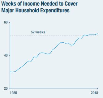
Oh, no! It takes more than 52 weeks of work to afford a middle class life on a middle class income! There’s not that many weeks in a year! That sounds pretty bad!
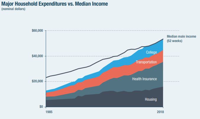
The chart that’s gone viral is this next one, showing the expenses broken out vs. income over time.
 .
.
Pretty dramatic stuff. Wages have gone up over time, sure, but they’ve just been dwarfed by the increased price of the major expenses. Heck, after all that, there’s not even money to pay for food!
The Problem
Again, there’s a lot in there. Almost every bit of it is controversial on a theoretical level. See, for example, this, this, and this.
What I want to focus on is that health care component. You can see from the second chart that it’s the biggest single driver of rising costs. That’s not too surprising because we all know that health care costs have been going up.
But there’s a problem. As most folks with jobs are aware, an employee
rarely pays the whole cost of their health insurance; their employer
pays some, too. But Cass is using the total cost as the price of health
care. So in essence, his cost
of thriving includes costs that a
wage-earner does not pay. 2
This mistake matters because it goes directly to what the COTI is supposed to measure. We’re supposed to be looking at how long someone has to work to pay for these four major categories. If we’re including things that the wage-earner doesn’t pay for himself, then we’re going to get the wrong picture—at least if the difference is large enough to matter.
What the COTI Says When Done Correctly
I’m not the first person to point this out, but I was curious just how big a problem this was, so I decided to reconstruct the index myself. First, I included the employer-paid health insurance premiums to make sure my number matched Cass’s. Then I recalculated it using using only the employee-paid portion, which I got from the same source. It’s worth pointing out that Cass gave clear enough indications of his sources and methods that I was able to reproduce most of his numbers exactly, and the ones that weren’t exact are close enough as makes no difference.3
So here’s what the weeks-of-work chart looks like with both with the
original index that incorrectly includes employer-paid premiums, and
with the recalculated index that only includes what employees actually
pay: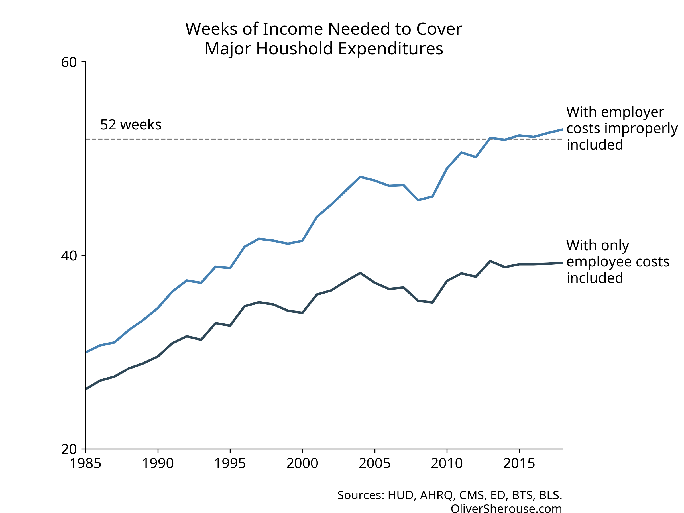
Oh. Instead of taking 53 weeks of work to pay for a middle class life, it’s actually 39. Not only is that a good bit less than a year, but it’s lower than where Cass’s original index had us in 1996. It’s unclear whether Cass thinks 1996 were good times and the trend is still up, but we see now that the four categories are less than all-consuming.
And what about the raw expenses chart? Here’s my recalculation of the
original, so you can see that even with a slightly different health
series, it’s the same story: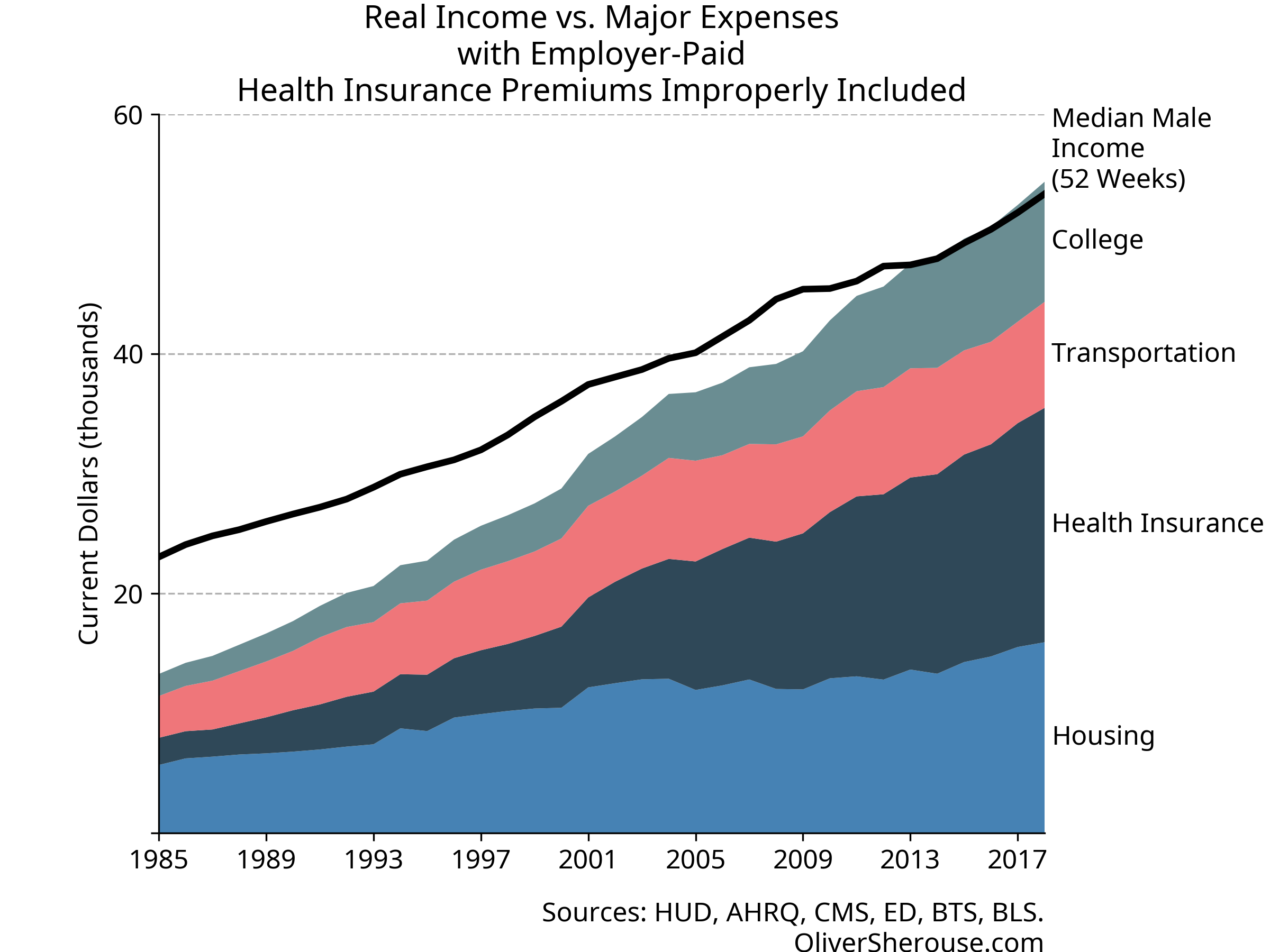
And here’s what it looks like when you count health insurance
properly: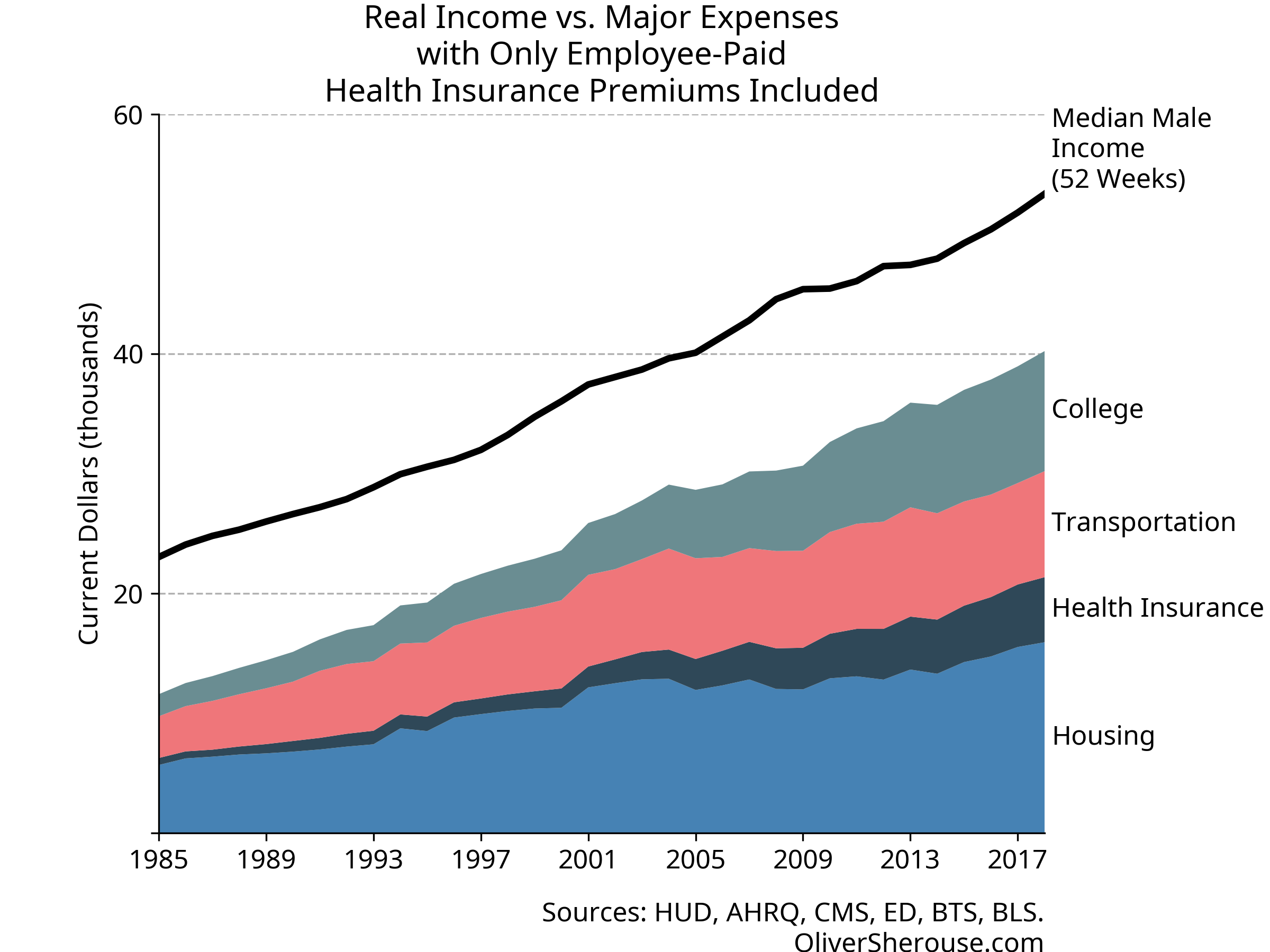
Well, then. Looks like the middle class still has a good bit of headroom, even after paying the price of thriving. And let’s not forget: the things that Cass includes in his major expenses are the ones where costs have gone up the most over time. The rest of that income can go to things like food, leisure, technology, and travel that have gotten cheaper, have improved in quality or convenience, and where a far greater variety is available than used to be. Not only can a single wage-earner still cover Cass’s expenses like they could in 1985, they can go beyond in many ways that were unimaginable back then.
A lot of folks have raised good criticisms of the Cost of Living Index. I think it’s wrong to cherry-pick the fastest-growing categories of expenditures. I think it’s wrong to ignore changes in quality over time. I think it’s wrong to ignore the unpaid work that women used to do more of as a group than they do now. But even if you ignore all of that, what the Cost of Thriving Index shows, at least when calculated properly, is that the middle class is doing just fine, thank you very much. Would it be good if the price of health care insurance and college were growing more slowly? Sure. Of course it would. But are they eating up the middle class? No. No they are not.
In theory, at least. I don’t have time for an Apple rant in the middle of this chart rant.↩︎
Economically, you could argue that the employee bears the cost of the employer share of insurance payments. In fact, I would argue that. But if you want to look at it that way, you’d need to add that to wages as income to make the index make sense. It wouldn’t really make a difference to my argument, so I kept it this way for simplicity.↩︎
All my work, including my source data is available on GitHub. The repository is here, the notebook with the calculations is here.
Cass uses a Kaiser Family Foundation estimate for health insurance costs; I looked at Kaiser and it pointed to the Agency for Healthcare Research and Quality. The AHRQ numbers do not exactly match the one Cass reports (they’re off by a few hundred dollars at both ends) and cover more years than he says Kaiser does. The differences are small enough that you can’t see them on the graphs except for the first few years, and I’m confident that whatever series he’s using and the one I used are very similar, especially in recent years.↩︎